
I often think a lot about psychology – more precisely psychology in marketing. We all have senses and out brains all work in a different way. We perceive things differently. Words, colours, logos, slogans…. While Marketers cannot appeal to everyone’s unique perception, we can appeal to the masses or majority of our audiences. (This keywords, demographics, ICP, lead scoring blah blah blah).
Over the past few weeks I’ve been researching, testing, and over-thinking, leading me to a bunch of tension headaches…. Let’s just call this the joy of pain.
I thought it would be helpful and interesting to share my findings so you can make your content as effective as possible. Over the next few weeks I will touch on a few subjects but in this article I’d like to talk about the magic of copy…. Or how to make your copy magical and get your point across.
The key? Make your content easy to read. Here are 8 ways to make your content stand out.
1. Stunning, Beautiful Open Space
It’s like a full breath of fresh crisp air in your lungs. It kind of makes everything better! Open space kills clutter. Clutter brings on confusion in your brain. Confusion diminishes the message.
Tip: Space things out. Add an extra space after paragraphs.
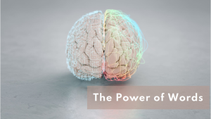
2. More Than Words; Images
An image is worth a thousand words (I think that’s how the saying goes). Images appeal to everyone by use of colours, composition, information, texture…. It really does add another element to appeal to the readers’ senses.
Appeal to the readers’ senses.
3. K.I.S.S And Stay Under 80
Different sources state different stats but a decent measurement is that the human attention span is anywhere from 7 – 8 seconds. This goes for attention per line as well. Keep each line between 50 – 80 characters to stay within that time range and subconsciously continue to keep the reader engaged.
The human attention span is anywhere from 7 – 8 seconds
80 characters to stay within that time range and subconsciously continue to keep the reader engaged.
4. Fonts Can Kill
Font size, type, kerning, justification…. It all counts. Why? Fonts load differently on different devices. Don’t tie directly into your brand. Fonts set the tone of the article. Fonts can easily grab or turn away a reader. Fonts can even tarnish the credibility of the author or organization.
This is the subject for another article but here are 3 tips:
Don’t use any fonts that are “fancy.”
Keep your copy to 16 points.
NEVER use Comic Sans.
Fonts can even tarnish the credibility of the author or organization.
5. Break It Up
Organize your content into sections with sub/headlines in slightly larger or bold font. Use h2 and h3 where appropriate which will also help your SEO. Use a br to create space.
6. Lists
Don’t be afraid to state short and concise blurbs in lists.
Lists are attractive to the eyes and are often subconsciously seen as facts.
Facts stand out.
7. To Emote, To Not Emote
Opinions differ but, depending on the audience, I never see the harm in throwing in a few relevant emojis here and there. The splash of colour and effect of visual representation and iconography gives
To the eye, a contrast break or burst of colour highlights specific content and keywords.
8. Word count
Elementor says a blog should be 1890 words.
Mail chimp says blogs should be 1500 -2000, press releases 400 – 700, and ‘how to’ blogs 1000 – 2500 words but never more than 3000 words.
Rockcontent says 1500 – 2000.
Scalenut says aim for a range based on the audience (1200 – 1800, 2000 – 3000).
Hubspot says that that their 16 most popular blogs had less than 1500 words.
Another source says keep it under 10,000 words.
Our friend, Chat GPT says follow 3 formats:
Short Blogs (300–600 words)
Standard Blogs (1,000–1,500 words)
Long-Form Blogs (2,000–3,000+ words)
The sweet spot? 1000 – 1500 words.
So, keep it between 400 – 10,000 words. Lol.
Wrapping It All Up
In my opinion the key thing here is about content. Make it clear, concise, not wordy, correct tense, and serve your content up on a silver platter. I’d say 1200 – 1500 words. Break up your text, use colour or a relevant and less-annoying emoji here or there and make your content easy to read and pull facts from. If you have too much content, do a part deux (II).
I did tutor English in my past and am obsessed with grammar (please do us all a favour and figure out how to use an apostrophe!) but I am NOT a copywriter or SEO professional.
So, if you disagree I’d love to hear your opinion…. Just be kind. …And ignore any spelling/grammatical errors. 😉